Too many asset managers haven’t optimized their websites for smartphones and tablets. They still prioritize desktop visitors and overlook mobile users. This is a big problem.
Mobile-first design is important because more than 50% of all website traffic in the United States currently comes from smartphones. A mobile-first approach ensures investors can easily find information, schedule consultations, and act—no matter what device they use. Moreover, designing for smaller screens first forces firms to prioritize content and functionality.
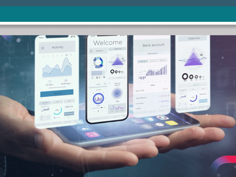
Read on for proven insights on how a mobile-first website strategy attracts, engages, and converts prospects.
Think Mobile First
What is mobile-first design? It’s when you build or enhance your website for mobile devices first—then modify the site to work for desktops, tablets, and laptops.
Mobile devices are now the primary way people access the internet.
People keep in touch with friends, family, and co-workers, read the news, make social plans—and check their investments with their smartphones. Here’s why financial services firms need to develop their websites with mobile as the priority:
- 63 percent of people in the United States use their smartphones rather than desktops to browse the internet
- Investor-aged people in the U.S. spend more than five hours daily on their mobile phones.
- People check their mobile phones over 35 times daily on average.
- Financial advisory firms that regularly use smartphones over desktops are more profitable and efficient.
Mobile-Friendly is Not Mobile-First
A note on terminology: A mobile-friendly site is not a mobile-first site. A mobile-friendly site is primarily built for desktop users and larger screens. Mobile-friendlies are created for big screens and then sized down to be effective on smaller ones.
By contrast, mobile-first websites are created for phones (and tablets) and sized to fit larger screens. Mobile-first design highlights digital experiences before desktop design. A responsive mobile design is a website that automatically adjusts its look for smartphones.
A user-first design strategy focuses on what your audience needs, users, whether it’s desktop or smartphone.
Why Mobile-First Websites?
Many asset manager websites are still desktop-focused. However, mobile-first websites can create a competitive advantage, build trust, and grow and retain clients more than other strategies.
Consider these three reasons why you must think first about mobile:
- Search engines prioritize the mobile experience over the desktop one. Google prioritizes the mobile version of your site in search rankings. The reason is that most users now access websites through their phones. The takeaway: Don’t be invisible.
- Mobile-first websites increase client engagement. A mobile-first website helps investors engage quickly, wherever they are, with investment opportunities and news. People don’t need to be in their offices in front of their computers to respond. Smartphones thus reduce friction—the steps required to get something done, like downloading a guide or setting an appointment. The takeaway: Mobile-first sites can lead to greater engagement.
- Mobile-first websites help prioritize content and functionality. Small screens force you organize and show your most essential content first. Plus, it’s easier to enlarge a small screen design than to make a large screen one smaller. Scaling up for larger screens preserves your content strategy; scaling down may mean cutting or hiding essential content.
Mobile-First Best Practices for Asset Manager Websites
A mobile-first website should prioritize the needs of your prospects and clients. Ask: What are your client’s pain points? How can you help them solve problems and achieve their goals?
Five mobile-first development tips include:
- Great content. It all starts with content. Your story, message, and brand are equally crucial for your website’s mobile and desktop versions.
- Simple design. Best design practices include a simple single-column format, an uncluttered look, legible typography, limited horizontal scrolling, plus plenty of white space. Many now use the “hamburger menu” (the three lines at the top on the navigation bar) for uncluttered navigation.
- Fast speed. Your page load times need to be lightning-quick. When slow, visitors will go elsewhere. You must optimize and compress website images and media. Mobile-first designs typically load faster because they have fewer bells and whistles than desktop sites.
- Prominent calls-to-action. For mobile-first sites, you must have prominent and accessible calls-to-action (CTA) on landing pages and easy-to-fill-out forms to generate leads. You should make it as easy as possible for people who want information to provide their contact info.
- Ongoing testing. Mobile devices, of course, come in different screen sizes, touch interfaces, and performance limitations. All need to be continually tested for lead-generation effectiveness and useability.
Don’t Forget Desktop-Only Users
People have not given up on their desktops. Individual high-net-worth investors and families often use several devices depending on what they need and where they are. They may use large-screen desktops for complex analysis and detailed portfolio management—and their smartphones for more personal interactions.
It’s not uncommon for institutional investors and portfolio managers to have two large screens on their desks for investment research and detailed portfolio management.
While the desktop-first design approach is, for many, history, the best approach is to prioritize mobile while ensuring desktop experiences are also robust.
The Last Word on Mobile-First Websites
It’s important to think first about your smartphone users—the majority of your website visitors. Keep your mobile website simple, clean, and functional. Remember:
- More investors now use smartphones than laptops
- Search engines love mobile
- Mobile-first gives you a competitive advantage over desktop-focused firms
- Mobile-first websites must meet the needs of your audience
- Your website is never done. Its critical to keep monitoring performance and improving it.
The ultimate goal, of course, is to provide a great website that encourages engagement and generates quality leads and new business.
Website design teams and clients need to understand that sites not developed for mobile-first won’t serve the needs of today’s investors.
How’s your current website doing? Get your complimentary website audit now.
Ready to build, rebuild, or enhance your website? Schedule a complimentary strategy session to discover how to elevate your brand, build trust, and attract more clients.
Frank Serebrin is Content Marketing Director for Sondhelm Partners. He leads strategic and creative content and marketing services for our asset management and wealth management clients.
Connect

